ProLon
Get in touch
ProLon sells fasting-focused nutrition products. I worked on increasing sales by redesigning the website.
ProLon is a nutri-tech company that sells fasting-focused food and nutrition products. I worked on increasing the conversion rate by redesigning the website.
ProLon is a nutri-tech company that sells fasting-focused food and nutrition products. I worked on increasing the conversion rate by redesigning the website. I was the only designer on it, and later ran it as project manager as well, across the UK and Italian sites.
The problem
The site of each European market had been built at a different time, with its own buying flow, layout and tracking. The new UK site, designed to raise conversion, was performing worse than the outdated Italian one.
The UK site had recently been rebuilt to raise conversion, and it was performing worse than the Italian one. Italy was the best performing market in Europe, on an older site. That contradiction is why I was brought in.
Each market's site had been built at a different time, with its own buying flow, layout and tracking, so there was nothing dependable to compare against either.
A newer site built to raise conversion was losing to an older one, and no two markets were built the same way.
The goal was one redesign that beats all, and a rollout to every market to unify them.
What I found
I started with the website analytics to understand where things stood, and quickly found inconsistencies: sales showed Italy ahead, analytics showed the UK. The tracking had not been set up correctly. The two sites counted different actions as a sale, and the three-step add to cart on the UK site was tracked as a single item, so we never knew which step people abandoned.
I started by looking at the website analytics to understand where things stood, but quickly found there to be inconsistencies: sales showed Italy ahead, analytics showed the UK.
Looking into it in more detail, I found the tracking was not set up correctly. The two sites were counting different actions as a sale, and time on page read zero. More importantly, the three-step add to cart process on the UK site was tracked as a single item, so we never knew which step the users abandoned. Italy's checkout step reported over 100%, which is not a number that can exist.
So my first step was to identify and fix the tracking issues, to have better comparison data from then on.
Before touching any design, I fixed the measurement, so there would be a way to tell whether the changes worked.
UKItaly
With the tracking right, I could see where people left. Of every 100 who opened a product page, only 23 put anything in the cart.
Once the tracking was right, I could see where people left. Of every 100 who opened a product page, only 23 put anything in the cart.
77 of every 100 people opened a product page and left it empty-handed.
Checkout is the usual suspect, but people were leaving long before it. Phones brought 60% of the revenue and converted worst, so I started there.
Checkout is usually the first place people look, but most visitors were leaving long before it. Phones brought 60% of the revenue and converted worst, so I started there.
Despite bringing most of the revenue, the experience was not optimized for mobile. Phones brought in 60% of the revenue while converting from product view to cart at a lower rate than desktop, 20.6% against 29.9%. The most valuable traffic was having the worst time.
Average scroll depth on the homepage was 27.3% across nine sections, so most visitors only saw the first two or three.
This meant we needed to move the most important information into those first sections.
Hotjar measures how far down a page people actually get, and it put the homepage average at 27.3%. This meant we needed to move the most important information into those first sections.
Then I analyzed the quiz data to understand who our consumers were:
Then I analyzed the quiz data to understand who our consumers were. 1,642 people had filled it in:
- 50–59 the largest age group
- 83% women
- 72% say weight loss is the goal
- #1 worry not being able to stick to it
- 2 in 3 already fast in some form
Users' main goal was to lose weight, they feared not being able to stick to the program, and they were already familiar with fasting.
As ProLon was built as a longevity product, the website was centered around that. The quiz results showed most people came for a different goal instead, and this informed the order of the content and the tone of the redesign.
As ProLon was built as a longevity product, the website was centered around that. The quiz results showed most people came for a different goal instead, and this informed the order of the content and the tone of the redesign. We also wanted to take people's fears and their prior knowledge into consideration.
What I changed
Two tracks ran side by side: keep improving the pages that were live, and build the version meant to replace them.
The first track was small fixes to the live UK and Italian sites: consistency, hierarchy, confusing navigation, buttons that did not work. Minimal investment, high return. The deliverables were reports from the GA4 and Hotjar research, split into short, mid and long term.
The first track was small UX and UI improvements to the UK and Italian sites: consistency, hierarchy, confusing navigation, buttons that did not work. Minimal investment, high return. This is where most of the research went, reading GA4 and Hotjar, and the deliverables were reports: what the data says, what it might mean, and what to do about it, split into short, mid and long term.
The second track was the redesign, rebuilt from scratch and taken into A/B tests to find the version worth rolling out everywhere. I ran that one with the developers, as project manager.
The second track was the redesign, rebuilt from scratch and taken into A/B tests, to learn what performs best in each market and find the one version worth rolling out everywhere. I took the project manager role on that one, running it with the developers.
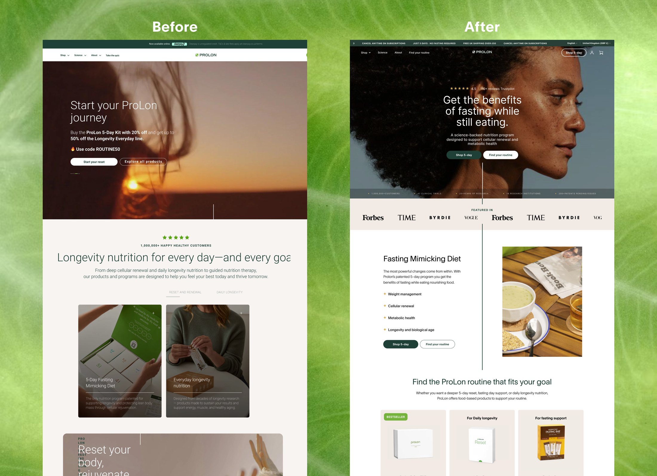
I compared the UK and Italian sites to understand why Italy converted better. The biggest difference was how people buy: on the UK site you had to go through a three-step add to cart process, where in Italy it was only one.
Adding to cart
UK
- 1 Product page No price shown
- 2 Flavor
- 3 Purchase type Subscription already selected for you
- 4 Add-ons Then add to cart
Italy
- 1 Product page Price and every option in one place, then add to cart
Notable changes
A single-page add to cart flow, with pricing visible
Instead of: three steps after the product page, with the price hidden at first
People were abandoning the three-step flow, and Italy was converting better with one.
The one-off kit selected by default
Instead of: repeated subscription being preselected
Trustpilot reviews were full of people who meant to buy one kit and found they had signed up to repeat deliveries.
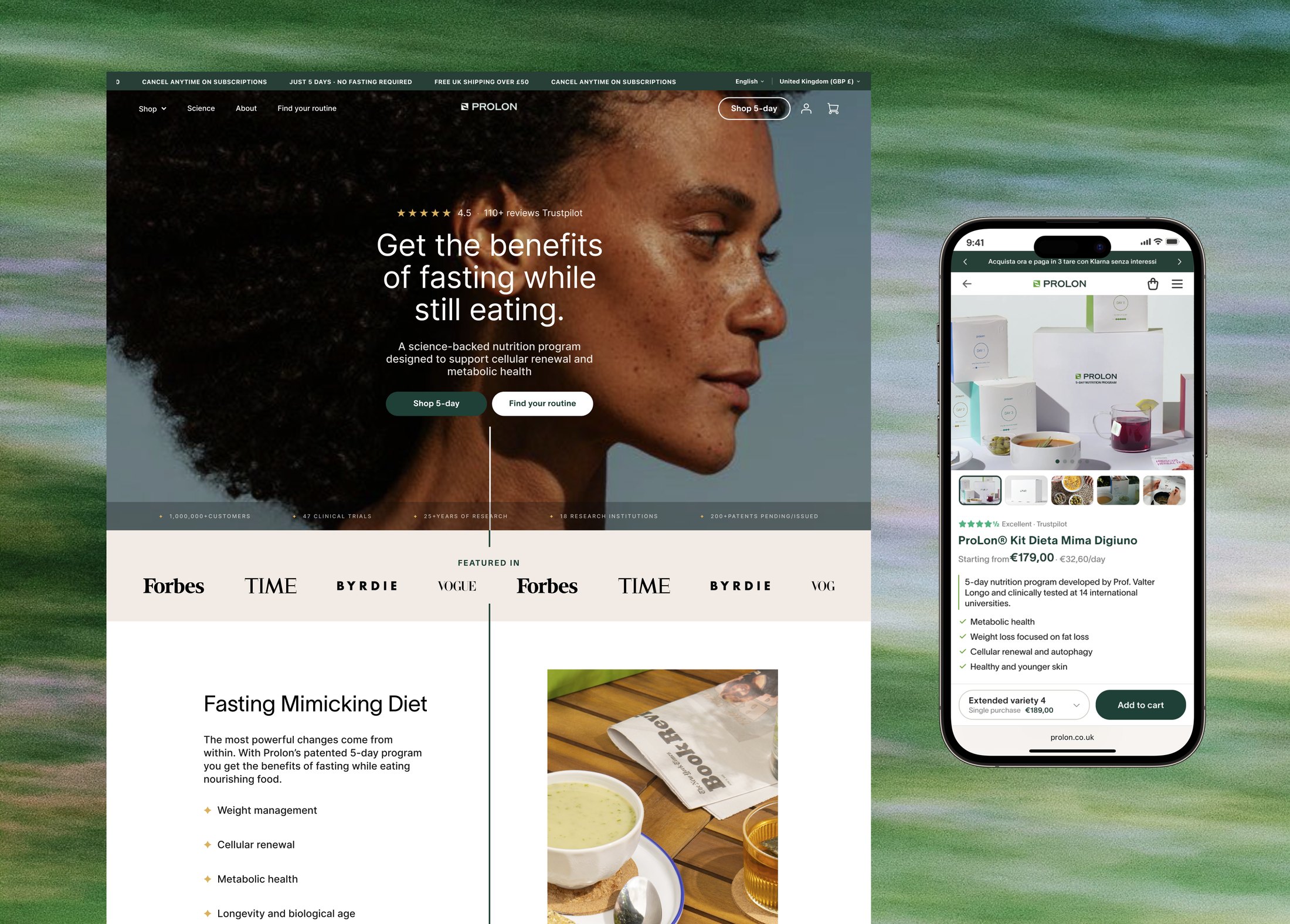
The most important sections first
Instead of: an order based on assumptions
Decision-making needed guiding, so the relevant information had to be where people were more likely to see it.
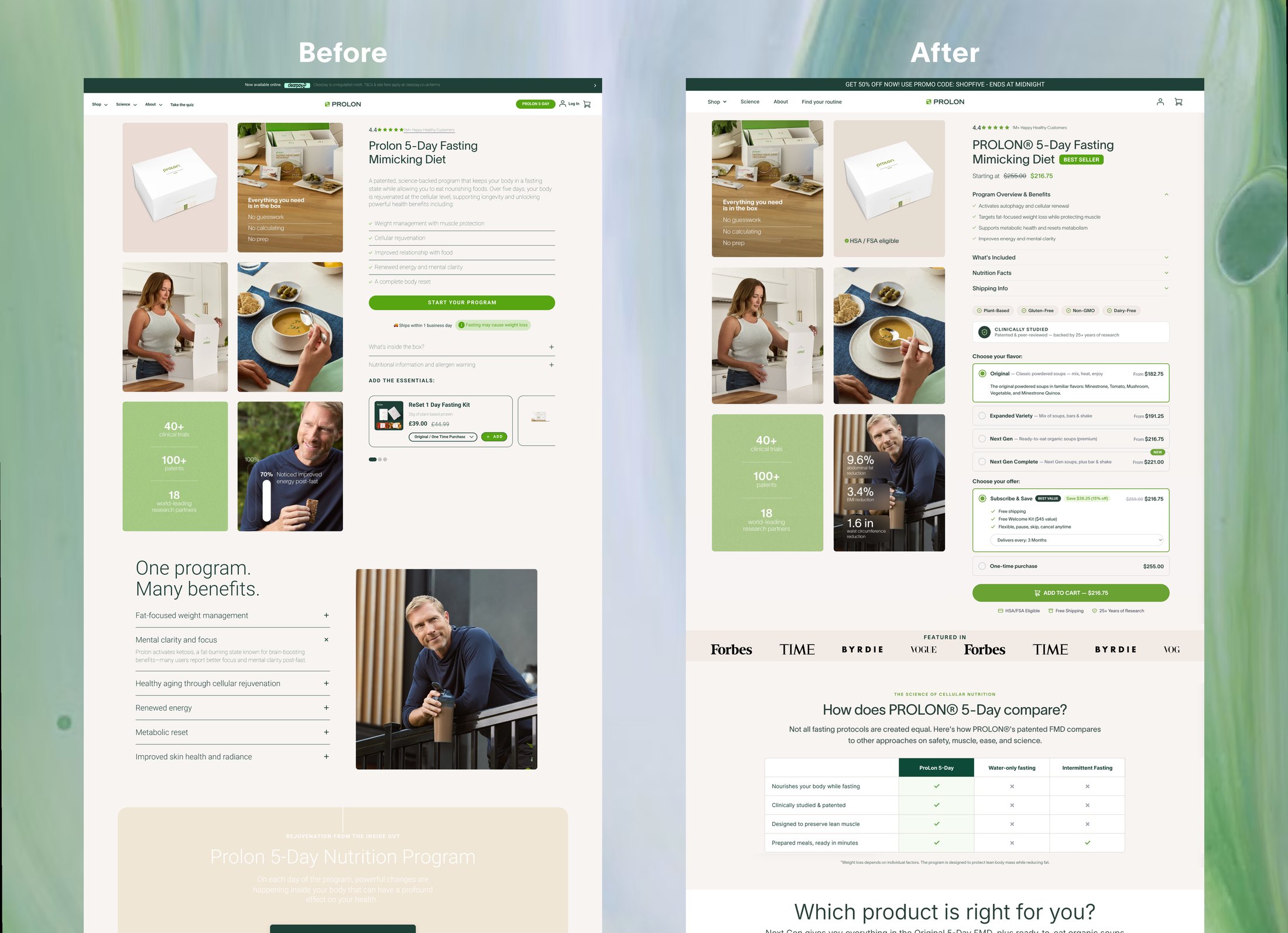
A bar fixed to the bottom of the phone screen, showing the selected flavor, the subscription type and the CTA
Instead of: the main CTA being lost on scroll
Reduces cognitive load by keeping the important information visible, so users don't have to remember.
Everything the user needs to make a decision is now visible at first glance: flavor, price, and the button.
On a phone
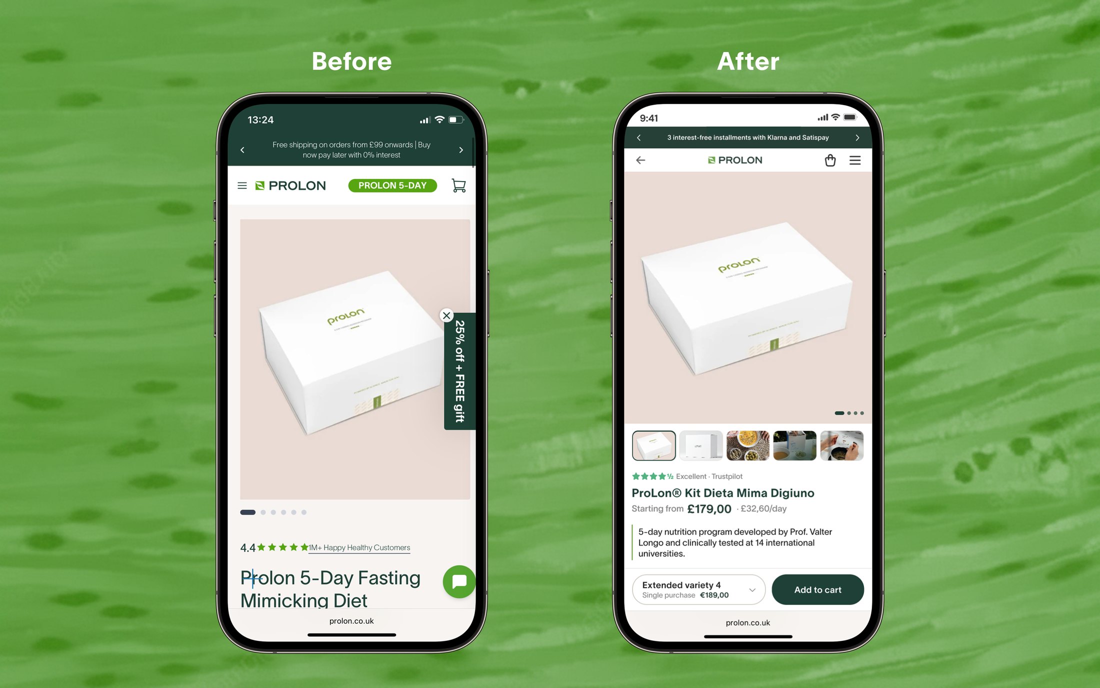
The adverts lead here, so many visitors arrive knowing nothing about ProLon. The first screen now says what it is and what it costs, per kit and per day.
The product page is also where the adverts lead, so many visitors arrive knowing nothing about ProLon. The first screen now tells them what it is and what it costs.
We also showed the price per day. For a five-day program the total sounds like a lot on its own, and per day it becomes a number people can compare with an ordinary week of food.
I also shortened the copy, keeping the SEO words that were bringing people in.
I also shortened the copy. The site was very text heavy, so I cut it down while keeping the most important SEO words, to avoid hurting the traffic that was already arriving.
Where it stands
Testing continues, and I add results as they come in.
First test · August to September 2026
We tested the redesign against the old pages for four weeks, with half the visitors seeing each.
Conversion up 2.6%, and the redesign is now our baseline.
Old pagesRedesign
- +2.6% conversion rate overall
- 1,448 visitors over four weeks
Overall conversion increased and new customers converted better. Returning customers showed a slight decline.
Overall conversion increased and new customers converted better. Returning customers showed a slight decline, most likely because the page now leads with explaining the product.
We are continuing to iterate.
Also on this project
- prolon.it UX roadmap, homepage and product page changes
- B2B portal full audit and three redesigned screens for clinics
- Email newsletter templates, new and rebuilt
- App early design work
- Podcast site redesigning the educational podcast website
What I learned
- The work isn't always where I expect it to be. I came in to redesign pages and spent the first stretch fixing how the data was collected.
- E-commerce behaves differently. There is no learning curve to rely on: people arrive and decide in seconds, and small things like which option is preselected can matter as much as the layout.
- Test a lot, but decide what is worth testing. I learned it is fine to rely on design intuition for some decisions, and each test costs weeks of traffic.
- The silver economy (the over-50 users) has its own rules. Simpler navigation, higher contrast, bigger text, and language that empowers rather than warns.
- What we assume people come for is often not why they come. We led with longevity, while most people told us weight loss was their first reason. That changed what the website prioritizes, and it also means our real competitors may sit in a different field.