Alidays
Get in touch
Alidays sells tailor-made travel, built by travel agents in an internal tool called ALYDA. I spent two years redesigning it.
Alidays sells tailor-made travel. Every trip is built by hand by an agent, in an internal tool called ALYDA. I spent two years redesigning that tool and the parts of the public website that feed it, as the only designer, working directly with the CEO, the CTO and the developers.
Alidays sells tailor-made travel. Every trip is built by hand by an agent, in an internal tool called ALYDA. I spent two years redesigning that tool and the parts of the public website that feed it, as the only designer, working directly with the CEO, the CTO and the developers. It began as a page redesign and turned into a study of how agents actually work, which is where most of the useful decisions came from.
The problem
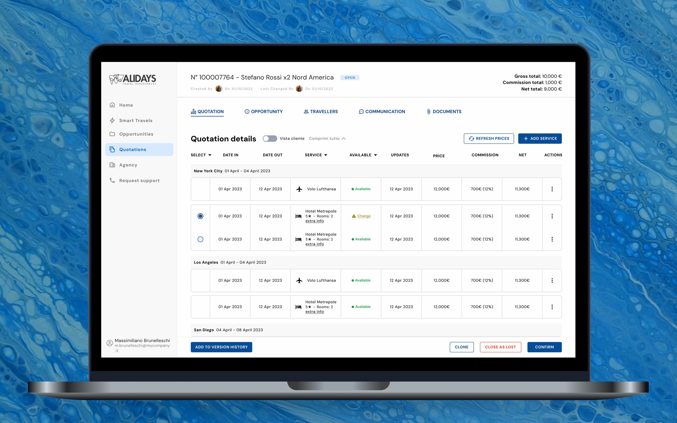
ALYDA is where agents do everything: flights, hotels, excursions, passengers, dates, the order of the cities. A client usually gets several versions of a trip, so an agent is often working on multiple versions of the same trip at once.
ALYDA is where agents do everything. Flights, hotels, excursions, passengers, dates, the order of the cities. A client usually gets several versions of a trip to choose between, so an agent works on multiple versions of the same trip, and has to keep track of each one.
Complex software like this usually comes with onboarding, but the need for repeated demonstrations showed how difficult the tool was to manage on your own.
It is common for complex software like this to come with onboarding and teaching webinars, but the need for repeated demonstrations here showed how difficult the tool was to manage on your own.
Good design should be intuitive, but users found the tool difficult to navigate even with regular how-to-use webinars.
What I found
I start a project by asking the company to tell me nothing about the product, so I meet it as a new user would. I often felt lost. After that came a heuristic analysis, and time spent understanding how agents actually use it. The problems fell into three groups.
When I start a project I ask the company not to tell me anything about the product, so that I come to it as the naive user does. I try to navigate it myself, and here I already found myself lost more often than not.
Then came a heuristic analysis, and time spent understanding how the agents were actually using the tool. The problems fell into three groups.
- You could not tell what mattered. Sections were unlabelled, related things sat apart from each other, and there was no hierarchy to follow. Important information was often hidden under a scroll.
- The interface was heavy and unintentional. The brand blue was used very widely and there was no relationship between color and function: the same color was used both for critical Submit buttons and for static section headers.
- It did not match the complexity of the work. There was no way to track versions of a quote, and services could only be handled one at a time. A change of dates had to be made service by service, even on a trip carrying a hundred items.
Agents were looking at this screen every day, yet they still struggled to find what they were looking for.
Designing for people who already know
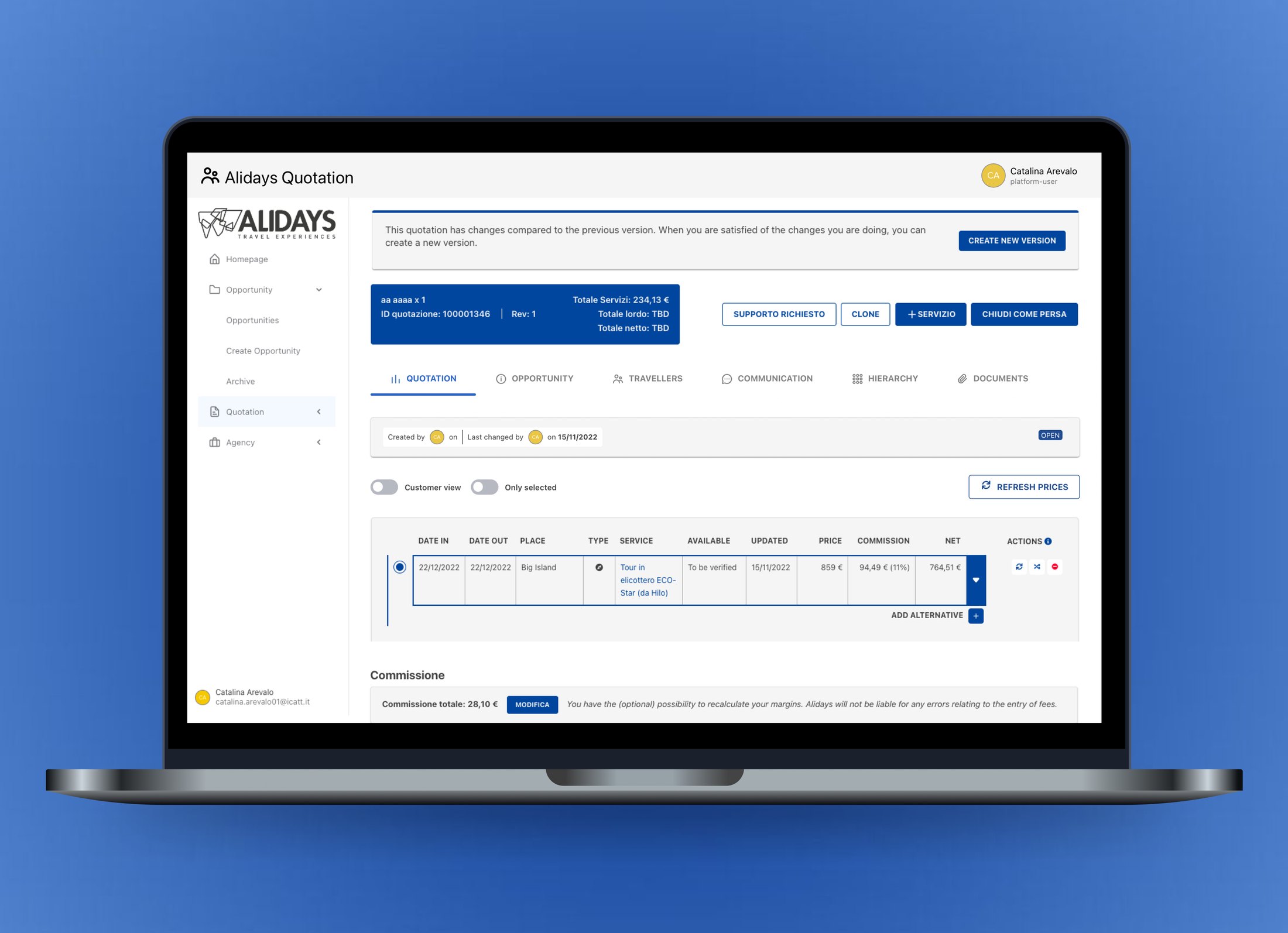
The most useful thing I got wrong was the map. Agents build an itinerary by choosing cities, so I designed something close to Google Maps, thinking it would help them get inspired: hover over a city and you see a photograph, a description and the activities you can do there.
Our internal travel agents told me they had been doing this job for years, so they knew the cities and what you could do in them. They needed to build itineraries quickly, and the tool needed to help with that. So I removed the photographs and the details, and kept the city names with quick actions to add a city to the trip and reorder the stops.
The most useful thing I got wrong was the map. Agents build an itinerary by choosing cities, so I designed something close to Google Maps, thinking it would help them get inspired: hover over a city and you see a photograph, a short description of the place, and the activities you can do there.
I got a great piece of feedback from our internal travel agents: they told me they had been doing this job for years, so they knew what the cities looked like and what they could do there. They only needed to be able to build itineraries quickly, and the tool needed to aid them in doing that.
So I removed the photographs and the details from the map and kept only the city names, with quick actions to add a city to the trip and reorder the stops.
I built a map full of photographs and descriptions, but the agents already knew all of it. They were power users, and the design needed to help them work faster.
They were power users who already knew what they wanted to do. The design needed to help them do it faster.
That lesson set the tone for the rest of it. These are people who look at this screen for hours, so anything decorative is something in the way.
What I changed
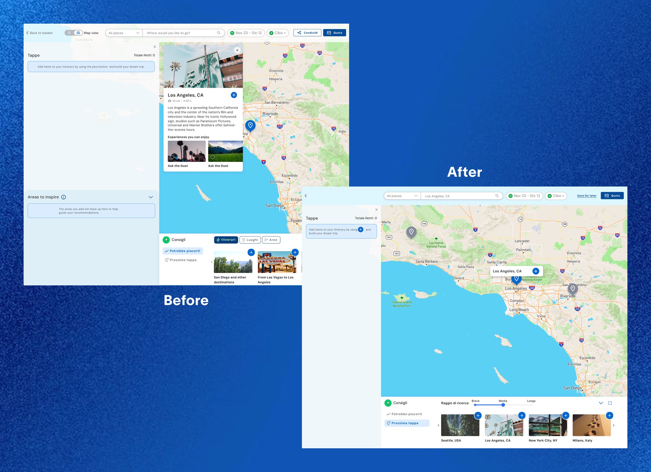
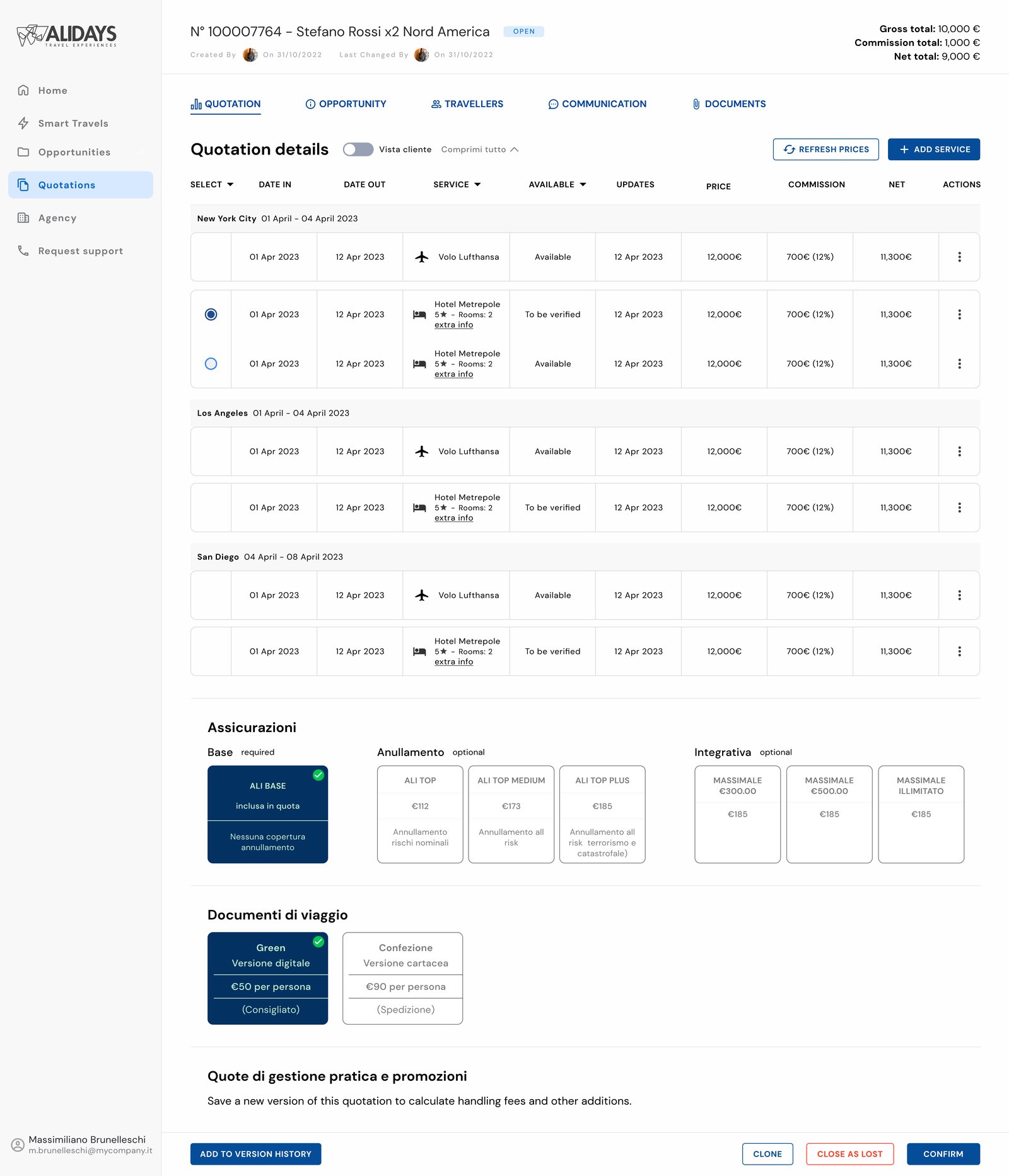
The tool now matches the work: group by place, compare alternatives, change many services at once.
- Grouped actions with the things they act on, rather than in a row of buttons at the top.
- Gave the information an order, with type, labels and color carrying it.
- Made the brand color mean action, so it says where to act.
- A fixed top bar with the file name and the running totals, so an agent can see which quote they are in and what a change has done to the price.
- Grouped services by location, and made alternatives look like alternatives rather than additions.
- Multiple selection, so changing a date across several services is one action instead of fifteen.
- Grouped actions with the things they act on, instead of collecting every button at the top of the page.
- Gave the information an order, using type, labels and color to carry it.
- Made the brand color mean action rather than decoration, and dropped the heavy shadows. Less tiring to sit in front of.
- A fixed top bar holding the file name and the running totals, so an agent can always see which quote they are in and what their changes have done to the price.
- Grouped services by location, and made it visible which services are alternatives to each other rather than additions.
- Filters on the column headers, availability shown as tags, and the hidden actions brought out where they could be seen.
- Multiple selection, so changing a date across several services is one action instead of fifteen.
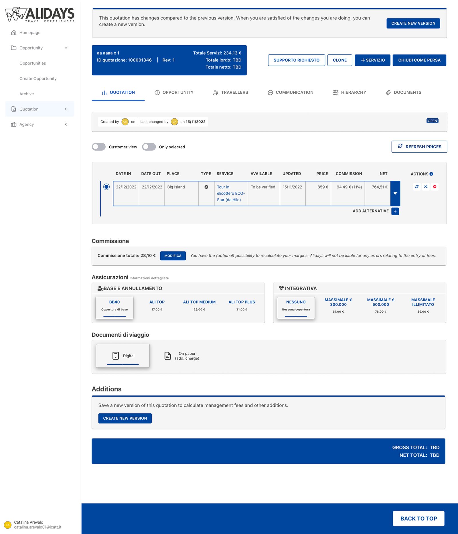
- Rewrote the insurance section to say what each package covers and which ones are actually required.
- Improved the general UI as well: alignment, spacing, type sizes and components.
The constraint that shaped it
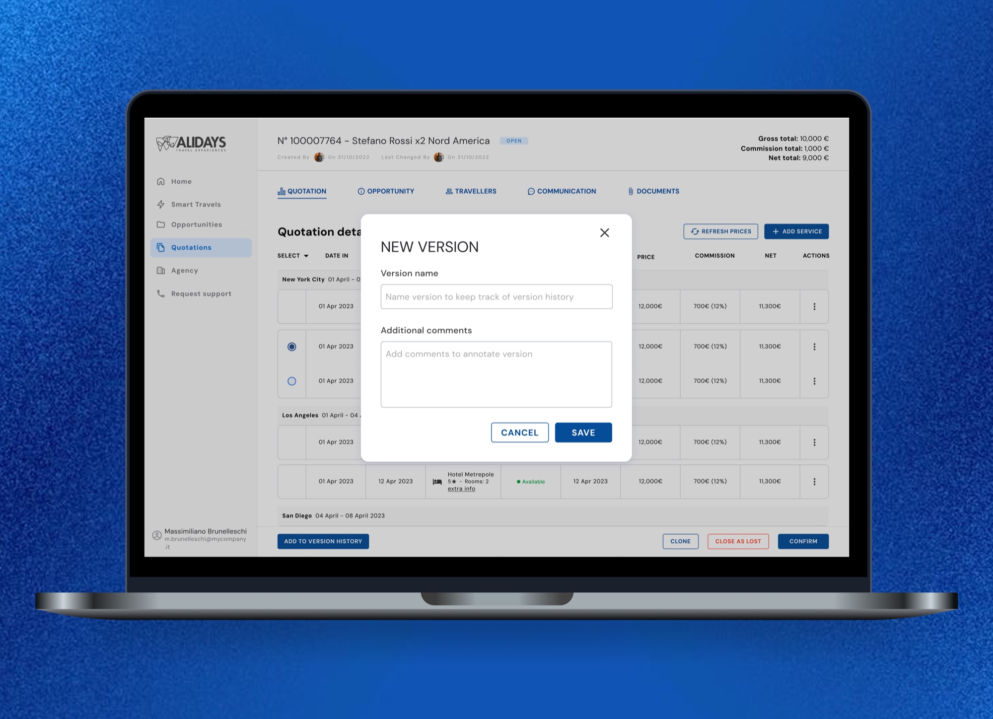
One of the biggest problems was that agents had no way to keep versions of a quote. The first solution to come to mind was an autosave, which we could not have at the time for technical reasons. So I included a Save Version button instead, to use whenever they have a working version.
That turned out better than autosave: not every change to a quote is meaningful enough to keep, and each version can be named and annotated, which makes the bookkeeping easier.
One of the biggest problems was that the agents had no way to keep versions of a quote. The first solution to come to mind was an autosave, which we could not have at the time due to technical limitations.
So I had to come up with something else, and settled on a Save Version button the agents could use every time they have a working version. That ended up being better than an autosave would have been. Not every change made to a quote is a meaningful one, so not every change needs saving and putting a load on the back end. And the agent can name each version and add notes to it, which makes the bookkeeping easier.
With no autosave to fall back on, saving became something the agent chooses and names.
A technical limitation turned into a better way of working.
This functionality shipped immediately.
The part the traveler sees
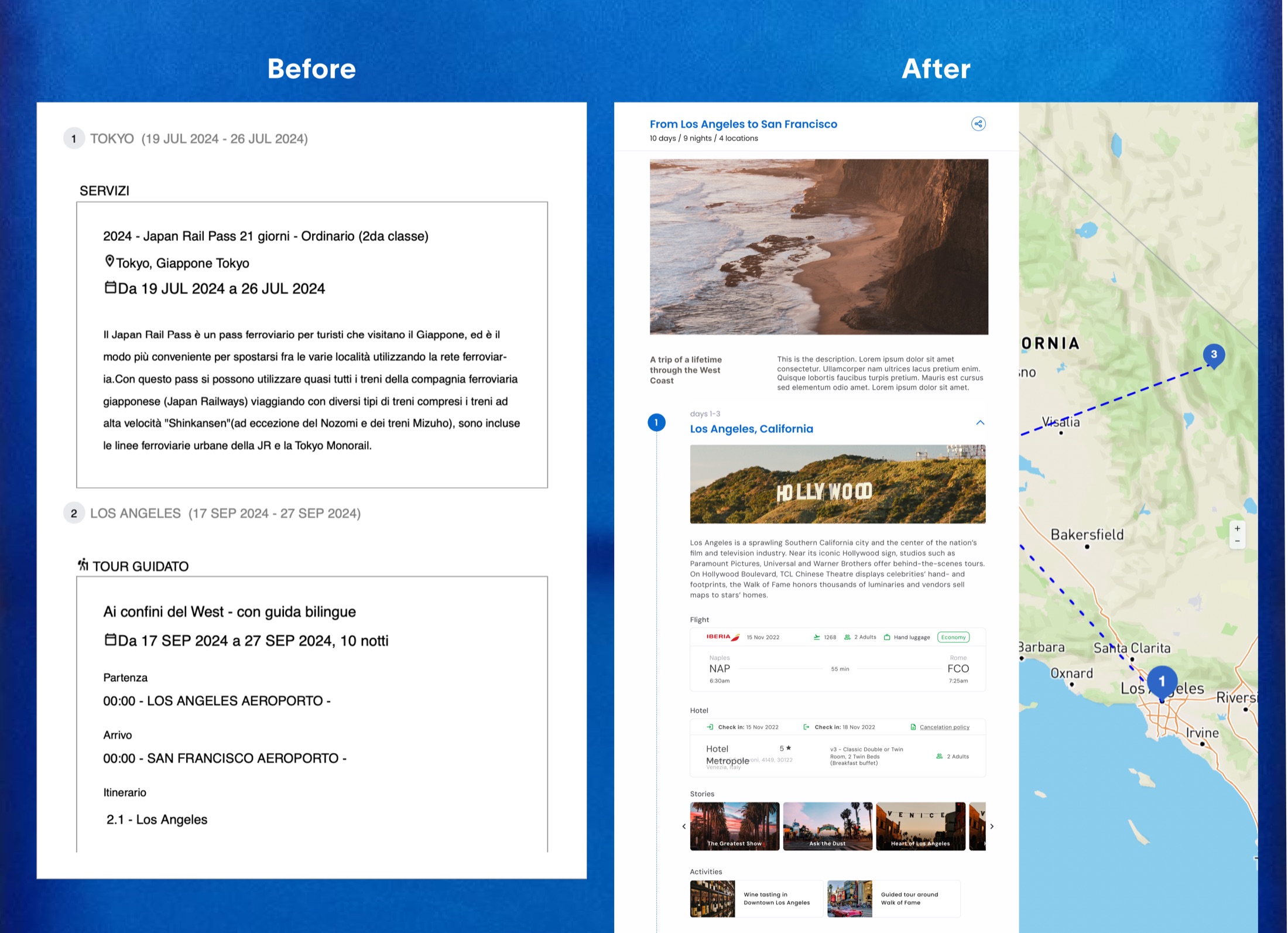
The quote is then sent to the traveler, and it used to arrive as a long block of text.
So we built a more visual version, designed to get travelers excited about their trip.
A quote does not stop at the agent. It gets sent to the person who is going on the trip, and it used to arrive as a long block of text.
We built ways to share an itinerary that were not only informative but also inspiring: a web version and a printable one, both designed so that travelers can already feel excited about their trip.
The itinerary the traveler receives was redesigned as well. The rest of the work was about handling complexity, but this part is about making someone want to travel.
The rest of the work was about handling complexity, but this part is about making someone want to travel.
The wizard, the other side of the same business
The next question was how to bring more people to the agencies. Alidays sells ALYDA to agencies and sells trips itself, so the two sides feed each other: a better tool is worth more to an agency with more clients in it.
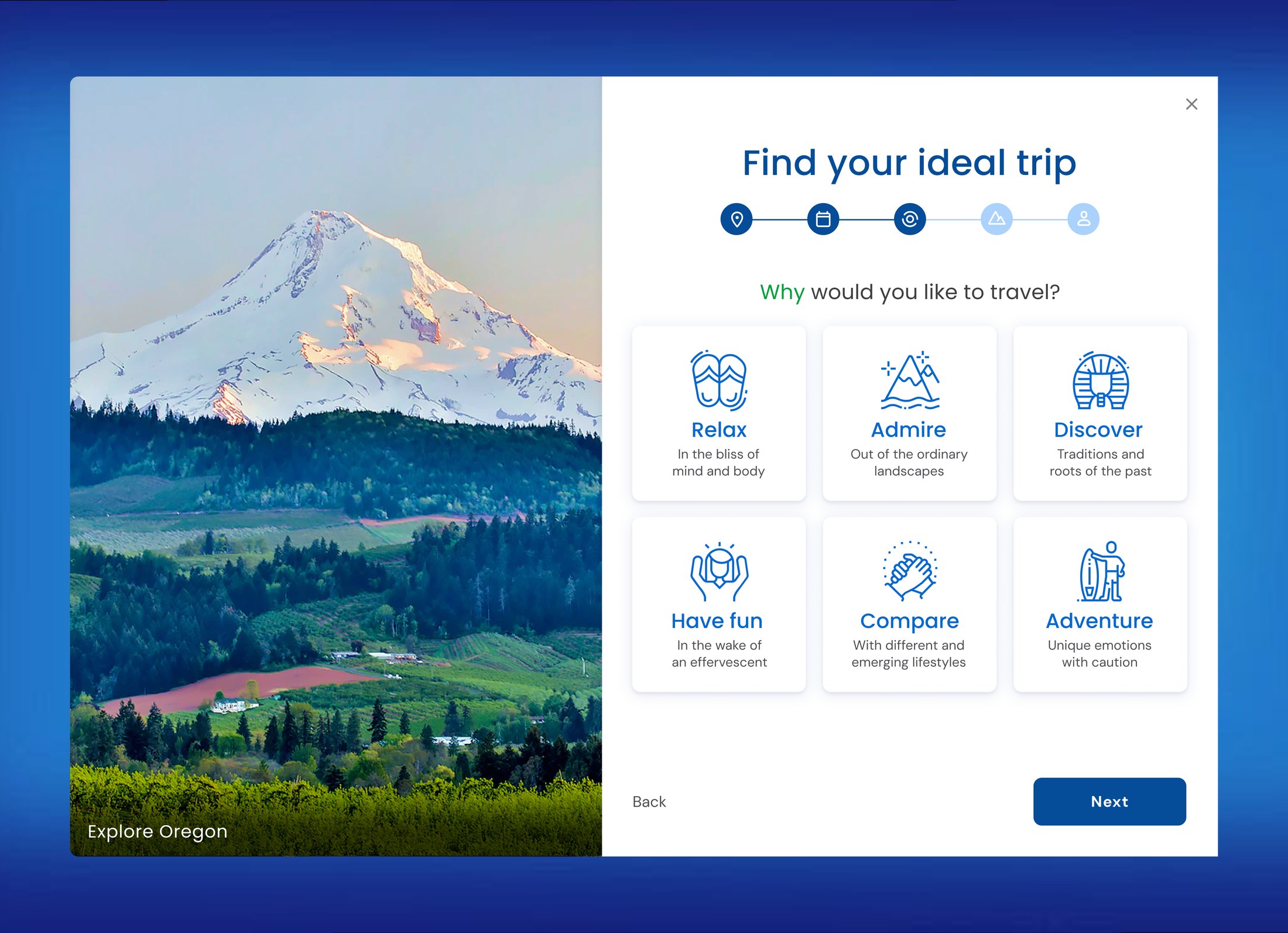
So we built a wizard on the public site: you answer a few questions and it puts together three trips for you, each one planned out day by day. Normally getting that far means contacting the agency, being assigned an agent and filling out a form or taking a call. The wizard does it in minutes, and gives you a link you can send straight to the agency.
So we built a wizard on the public site, for travelers rather than agents. You answer a few questions like where you want to go, why you are traveling, how long you have and the kind of trip you are after, and it puts together three trips for you, each one a full itinerary planned out day by day. Getting that far normally means contacting the agency, waiting to be assigned an agent and then filling out a long form or having a call. The wizard does it in minutes, and gives you a link you can send straight to the agency, so the meeting with an agent starts with a trip already on the table. It is fun to play with as well, which picks up people who would otherwise read the page and leave.
- 30% of every lead Alidays received in the wizard's first six months came through it
- 22 partner agencies asked to run it on their own websites
With just a few questions, a traveler is matched with three personalized trips to choose from. Initially built for one website, it ended up running on twenty-two.
Built for one website, and ended up running on twenty-two.
Where it stands
It is in daily use, with positive feedback from the agencies.
The redesign went live and is still in daily use.
We got positive feedback from the agents using it, and one webinar was enough to introduce it.
To complete the project, I wrote a roadmap of further improvements for the next iterations: refinements to filters and grouping, clearer handling of services that are alternatives to each other, and a round of user testing.
Also on this project
- Mobile app a travel companion for people already on the trip, designed from scratch with Catalina Arevalo
- Smart tips suggesting the next stop on an itinerary, from the cities already in it
- AI planner an AI travel planning tool I started, and handed over when I left
- Travel documents redesigned the invoices, vouchers and the rest of the paperwork a trip generates
- Smaller pieces store locator, callback flow, premium services, newsletters, brand guidelines
What I learned
- Designing for experts is different from designing for beginners. What looked helpful to me was something in the way of people who already knew the answer.
- A constraint can improve a design. We could not afford autosave, but deliberate version saving turned out to suit the work better.
- Work built for one place can travel. The wizard was made for one website and ended up running on twenty-two.