AI SRE Agent
Get in touch
An AI SRE agent watches a company's cloud systems, spots incidents, and investigates them on its own. I spent two months redesigning it.
An AI SRE agent watches a company's cloud systems, spots incidents, and investigates them on its own. I spent two months redesigning it with the client's design team, up to a relaunch at a tech fair. The client is under NDA, so this page describes the work rather than the product.
An AI SRE agent watches a company's cloud systems, spots incidents, and investigates them on its own. I spent two months redesigning it with the client's design team, up to a relaunch at a tech fair, presenting to them every day alongside two other designers. I had not worked in site reliability before, and most of the work turned out to be deciding how much of the agent's reasoning an engineer needs to see before they will act on it. The client is under NDA, so this page describes the work rather than the product.
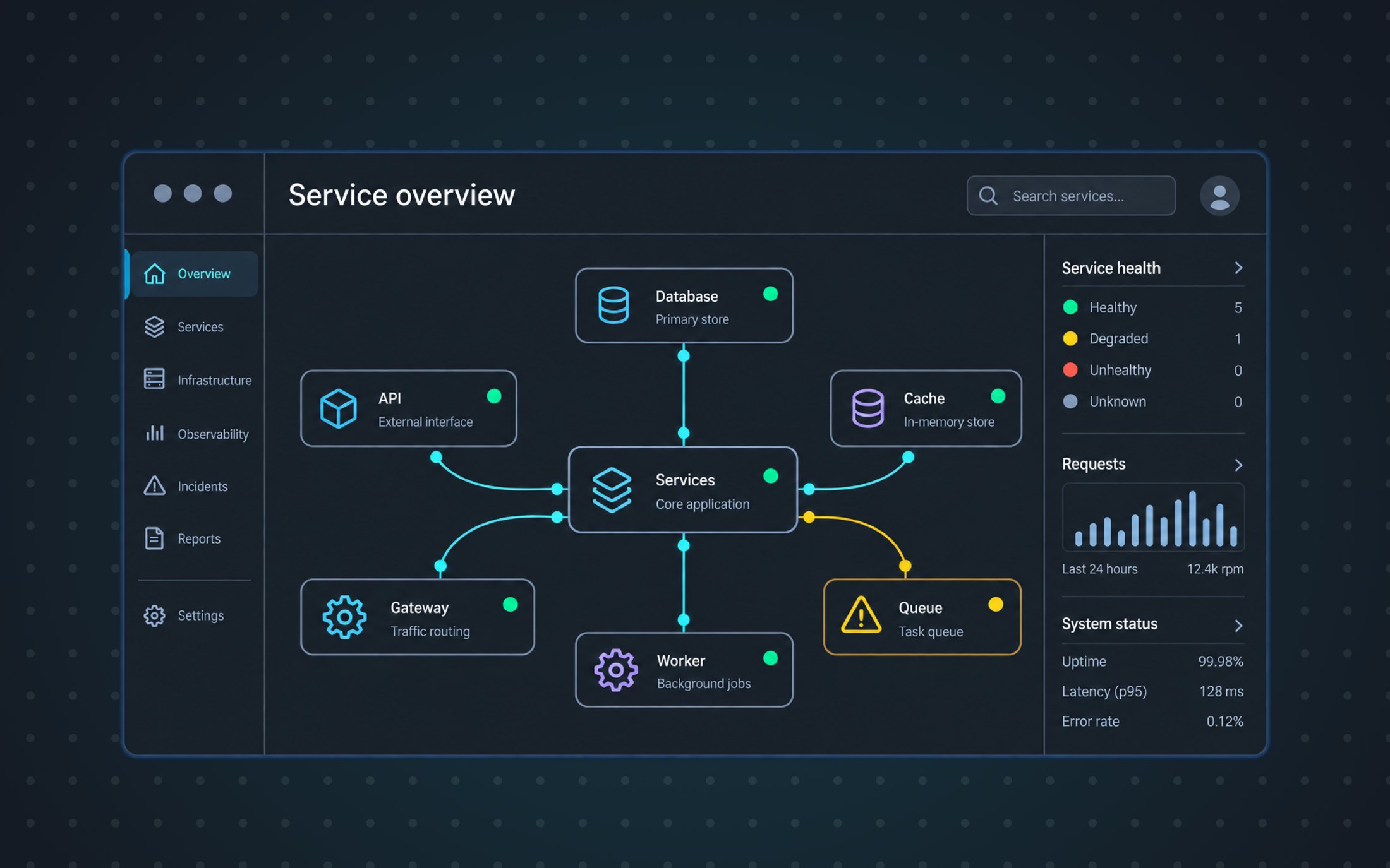
None of the images on this page are the real interface. They are representations I made to show the kind of screens involved, with invented services and data.
The problem
SRE stands for site reliability engineering: the people who make sure websites and apps stay online, run fast, and do not go down. An AI SRE agent does part of that job by itself. It detects incidents, investigates them, and helps resolve them, across cloud infrastructure and the tools a team already uses.
In practice it is watching for things like latency climbing in a payments service, an authentication error rate creeping up, or a memory leak in notifications. Then it works out what is going on and says what it thinks you should do next.
What it is watching
Services and what depends on what. The agent watches this, so when latency climbs in payments it already knows what sits behind it and what will feel it next. Following that chain is the reasoning an engineer has to be able to check.
The agent was already doing the work well. Engineers were overriding conclusions that were right, because they could not see how it got there.
Engineers were overriding an agent that was right because they could not see how it got there.
27% of the SRE agent's correct conclusions were distrusted because the reasoning behind them was hard to follow.
The bridge
The hard part of designing for an autonomous agent was not the interface but earning the trust.
So we made the investigation itself visible: the steps the agent took, and what it decided at each one.
So we gave them the behind the scenes, by making the investigation itself visible: the steps the agent took, and why it made the decisions it made.
An agent that investigates on its own produces a lot of reasoning. Showing too little of it makes people distrust the conclusion, but showing too much of it gives engineers piles of logs to read, which is the problem the agent was there to solve in the first place.
So the work sat between two things that were both already true: what the system was capable of, and how the people using it already think about their own infrastructure. Design was the part in the middle.
What I found
Learning a system I did not know
I had not worked in site reliability before this, so I spent a lot of time researching and understanding the context.
I had not worked in site reliability before this, so I spent a lot of time researching and understanding the context: how these teams are organized, which tools they already use, what an incident actually looks like, and simply getting up to date with the terminology.
We had to understand what an engineer worries about during an incident before deciding what belongs at the top of the screen.
We had to understand what engineers worry about before deciding what belongs at the top of the screen.
Research with the time we had
With this timeline and budget there were no resources for direct user research, so I leaned on desk research and on asking the team more questions.
So I learned from the client, who had been talking to these customers for years, and from general design experience: if two numbers are meant to be compared, they want to be next to each other.
So I learned from the client, who had been talking to these customers for years and knew which dashboards and alerting tools they already work in every day. The rest was general design experience: if two numbers are meant to be compared, they want to be next to each other.
With no budget for user research, we learned from the client who had been working with these engineers for years.
What I changed
One presentation a day
There was a fair to relaunch at, so we showed the client something every day. With that pace, we built the prototypes of our designs directly in code, with Claude Code and Cursor.
There was a fair to relaunch at, so we showed the client something every day. I was presenting to them directly, alongside two other designers and the product managers who gave feedback.
With that pace, we built the prototypes of our designs directly in code, with Claude Code and Cursor.
We built clickable prototypes for the client to review every day.
By giving the client something they could test directly, we were able to speed up every round of feedback.
A console, not a dashboard
The previous design had big metric cards at the top of the main screen, but there was a mismatch between the user and the information: the metrics answered a manager's question, and it was SREs who were looking at this screen.
An engineer should see what is wrong and what to do next at first glance.
So the test for anything on the console was whether it made those two things clear the moment an engineer arrives.
We moved the metrics to a separate view for managers. Once they were gone we started calling it the console instead of the dashboard, which is closer to how it actually gets used: somewhere you work, not somewhere you check numbers.
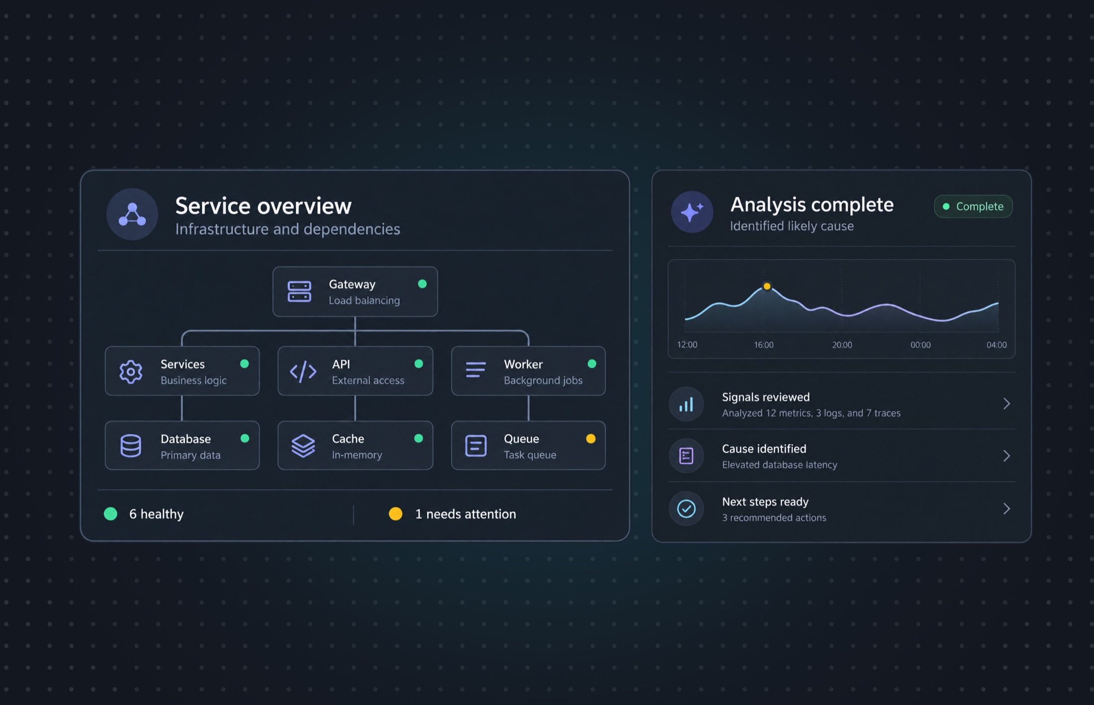
Every investigation also shows how confident the agent is in it, so an engineer can judge how much weight to give the conclusion.
The old interface was also dense and heavy to look at. Engineers keep this screen open all day, so a lot of the work was simply making it lighter.
Ranking alerts by impact
A screen full of alerts does not tell an engineer which one to look at first, so we scored them and ordered the list by impact.
A screen full of alerts does not show an engineer which one to look at first.
So alerts get scored in the background on what can be measured, and the list is ordered by the result: high, medium or low.
So alerts get scored in the background on things that can actually be measured: how severe it is, how many systems it touches, what depends on what. That produces a rating of high, medium or low, and the list is ordered by it.
How an alert gets its place in the list
Scored on things that can be counted, then sorted by the result.
Instead of reading through a feed to work out what matters, the engineer arrives at a list that already suggests where to start. The ordering guides them, but they are still free to begin somewhere else.
Onboarding that adapts
Onboarding used to ask the same questions in the same order for everyone, and one missing detail could prevent the user from proceeding. We replaced it with something closer to a conversation: it asks about the role and adapts to each answer, ending with a project set up, the tools connected, and an agent configured for the work you actually do.
Onboarding used to be a stepper: the same questions in the same order for everyone. If one of the details it asked for was missing, such as a key provided by the company, you could not proceed.
We replaced it with something closer to a conversation. It asks about the role first and adapts to each answer as it goes, because a security engineer and a platform engineer do not need to be asked the same things. Some answers are free text and some are options, depending on which gets a better answer. By the end there is a project set up, the tools connected, and an agent configured for the work you actually do.
Each answer changes what gets asked next, starting with the role.
Each answer changes what gets asked next.
This part received particularly positive feedback from the customers.
The small things
We worked on a lot of small changes to improve the experience: a single pattern for creating and editing a project, project cards that show their state, pinning and tagging to keep them organized, and filters people can save.
We also worked on a lot of small changes to improve the experience.
- Matching patterns for creating and editing. Both now follow the same steps, so there is one pattern to learn instead of two.
- Projects with state tags. A tag on the card says healthy, or how many alerts are open.
- Pinning and tags. Users choose which projects stay at the top, and can group the rest according to their needs.
- Advanced filters and saved views. Finer filtering on alerts, and views people can build for their own way of working.
- Loading states. An investigation takes time, so the wait had to be designed as well.
- Matching patterns for creating and editing. A new project is set up in a few steps, which mirror the tabs in the edit project view. That gives the user one pattern to learn instead of two.
- Projects with state tags. I asked what actually tells one project apart from another to decide which information belongs on the card versus the detail view. The cards now carry a state tag showing how many alerts are open in the project.
- Pinning and tags. Projects had no organization, which made the page difficult to navigate. Pinning lets users decide which projects stay at the top, and tags let them group the rest according to their needs, like every project in London.
- Advanced filters and saved views. Finer filtering on alerts, and saved views, so users can build their own way of working.
- Loading states. An investigation takes time, so the wait had to be designed as well. We tried to make it enjoyable without making it unserious.
Where it stands
It shipped and relaunched at the fair two months after we started.
Both we and the client were happy with how it came out. My part ended there, and their internal team picked up the iterations.
What I learned
- Designing for an autonomous product is mostly about trust. Engineers needed to see how the agent had reached a conclusion before they trusted the decision.
- Building prototypes in code changed how we worked. I learned Claude Code and Cursor on this project, and being able to hand the client something to test every day made the feedback more concrete.
- Without user research, I leaned on what already existed. The client had years of conversations with these customers, and the tools engineers already work in answered a lot of the questions.